How to Build a Settings Page That Does Not Suck

Settings pages are where UX goes to die. They are the junk drawer of product design — the place where every configuration option, preference, and toggle gets dumped without much thought about the person who has to find and use them.
We have built settings interfaces for every product at Threshline. LancerSpace has workspace settings, billing, notification preferences, and team management. MindHyv has business profile configuration, booking settings, and payment setup. Trackelio has project settings, widget customization, and integration configuration. Each one taught us something about what makes settings usable — and what makes them frustrating.
Here is what we have learned.
Organize by Task, Not by Technical Category
The most common mistake in settings design is organizing by system architecture instead of user intent. You end up with sections like “Account,” “System,” “Preferences,” and “Advanced” — labels that mean something to the developer who built them and nothing to the user trying to change their notification frequency.
Instead, organize by what the user is trying to accomplish:
Bad organization (technical):
- Account
- Preferences
- Notifications
- Integrations
- Advanced
- System
Better organization (task-based):
- Profile and Login
- Notifications
- Billing and Plans
- Team Members
- Connected Apps
- Data and Privacy
The task-based labels describe outcomes. “Profile and Login” tells me I can change my name, email, or password. “Account” tells me nothing — it could contain anything.
For apps with many settings sections, a sidebar navigation pattern works well:
const settingsSections = [
  { id: "profile", label: "Profile", icon: UserIcon },
  { id: "notifications", label: "Notifications", icon: BellIcon },
  { id: "billing", label: "Billing & Plans", icon: CreditCardIcon },
  { id: "team", label: "Team Members", icon: UsersIcon },
  { id: "integrations", label: "Connected Apps", icon: PlugIcon },
  { id: "privacy", label: "Data & Privacy", icon: ShieldIcon },
] as const;

function SettingsLayout({ children }: { children: React.ReactNode }) {
  const [activeSection, setActiveSection] = useState("profile");

  return (
    <div className="flex gap-8 max-w-5xl mx-auto py-8">
      <nav className="w-56 shrink-0">
        <ul className="space-y-1">
          {settingsSections.map((section) => (
            <li key={section.id}>
              <button
                onClick={() => setActiveSection(section.id)}
                className={`w-full flex items-center gap-3 px-3 py-2 rounded-lg
                  text-sm text-left transition-colors
                  ${activeSection === section.id
                    ? "bg-neutral-800 text-white"
                    : "text-neutral-400 hover:text-white hover:bg-neutral-800/50"
                  }`}
              >
                <section.icon className="w-4 h-4" />
                {section.label}
              </button>
            </li>
          ))}
        </ul>
      </nav>
      <main className="flex-1 min-w-0">{children}</main>
    </div>
  );
}
On mobile, the sidebar collapses to a horizontal scroll or a full-page list that navigates to each section. Do not try to show the sidebar and content simultaneously on a small screen — it does not work.

Save Behavior: Auto-Save vs. Explicit Save
This is one of the most debated patterns in settings design, and the answer is: it depends on the stakes.
Auto-save works for low-stakes, single-field changes:
- Toggling notifications on/off
- Switching a theme from light to dark
- Changing a display language
- Enabling or disabling a feature flag
When the user flips a toggle or selects an option from a dropdown, the change should take effect immediately. Show a brief confirmation — a subtle toast or a checkmark that fades in next to the control — so the user knows it saved.
function ToggleSetting({
  label,
  description,
  value,
  onChange,
}: {
  label: string;
  description: string;
  value: boolean;
  onChange: (value: boolean) => void;
}) {
  const [saving, setSaving] = useState(false);
  const [saved, setSaved] = useState(false);

  async function handleChange(newValue: boolean) {
    setSaving(true);
    await onChange(newValue);
    setSaving(false);
    setSaved(true);
    setTimeout(() => setSaved(false), 2000);
  }

  return (
    <div className="flex items-center justify-between py-4">
      <div>
        <p className="font-medium">{label}</p>
        <p className="text-sm text-neutral-400 mt-0.5">{description}</p>
      </div>
      <div className="flex items-center gap-3">
        {saved && (
          <span className="text-xs text-green-400">Saved</span>
        )}
        <Switch
          checked={value}
          onChange={handleChange}
          disabled={saving}
        />
      </div>
    </div>
  );
}
Explicit save (with a Save button) works for high-stakes, multi-field changes:
- Updating billing information
- Changing your email address or password
- Modifying team permissions
- Editing business profile details
These changes have consequences. The user should review what they have entered before committing. An explicit Save button provides that checkpoint.
When using explicit save, add two things: a dirty state indicator and a discard option.
function ProfileSettings() {
  const [profile, setProfile] = useState(initialProfile);
  const [isDirty, setIsDirty] = useState(false);
  const [isSaving, setIsSaving] = useState(false);

  function handleChange(field: string, value: string) {
    setProfile((prev) => ({ ...prev, [field]: value }));
    setIsDirty(true);
  }

  function handleDiscard() {
    setProfile(initialProfile);
    setIsDirty(false);
  }

  async function handleSave() {
    setIsSaving(true);
    await updateProfile(profile);
    setIsSaving(false);
    setIsDirty(false);
  }

  return (
    <div>
      <h2 className="text-xl font-semibold">Profile</h2>

      <div className="mt-6 space-y-5">
        <Field
          label="Display name"
          value={profile.name}
          onChange={(v) => handleChange("name", v)}
        />
        <Field
          label="Email"
          value={profile.email}
          onChange={(v) => handleChange("email", v)}
        />
        <Field
          label="Bio"
          value={profile.bio}
          onChange={(v) => handleChange("bio", v)}
          multiline
        />
      </div>

      {isDirty && (
        <div className="mt-6 flex items-center gap-3 p-4 bg-neutral-900
                        rounded-lg border border-neutral-800">
          <p className="text-sm text-neutral-400 flex-1">
            You have unsaved changes
          </p>
          <button
            onClick={handleDiscard}
            className="px-4 py-2 text-sm text-neutral-400
                       hover:text-white transition-colors"
          >
            Discard
          </button>
          <button
            onClick={handleSave}
            disabled={isSaving}
            className="px-4 py-2 text-sm bg-blue-600 rounded-lg
                       font-semibold hover:bg-blue-500 transition-colors
                       disabled:opacity-50"
          >
            {isSaving ? "Saving..." : "Save changes"}
          </button>
        </div>
      )}
    </div>
  );
}
The unsaved changes bar should be persistent and visible — fixed to the bottom of the settings panel or inline below the form. Do not hide it. Users who navigate away from settings with unsaved changes should get a confirmation dialog. Losing 5 minutes of configuration because you accidentally clicked “Billing” in the sidebar is infuriating.
The Danger Zone
Every settings page has destructive actions: delete account, remove team member, revoke API key, cancel subscription. These need special treatment.
Visually separate them. Put destructive actions at the bottom of the page, in a distinct section with a clear border or background. Red text or a red border works. The spatial separation signals “this is different from the settings above.”
Require confirmation. A single click should never trigger a destructive action. Use a confirmation dialog that explains the consequences in plain language.
For the most destructive actions, require typed confirmation:
function DeleteAccountSection() {
  const [showConfirm, setShowConfirm] = useState(false);
  const [confirmText, setConfirmText] = useState("");
  const [isDeleting, setIsDeleting] = useState(false);

  const canDelete = confirmText === "delete my account";

  async function handleDelete() {
    setIsDeleting(true);
    await deleteAccount();
    // Redirect to goodbye page
  }

  return (
    <section className="mt-12 pt-8 border-t border-red-900/50">
      <h3 className="text-lg font-semibold text-red-400">Danger Zone</h3>
      <p className="mt-2 text-sm text-neutral-400">
        Permanently delete your account and all associated data.
        This action cannot be undone.
      </p>

      {!showConfirm ? (
        <button
          onClick={() => setShowConfirm(true)}
          className="mt-4 px-4 py-2 text-sm border border-red-800
                     text-red-400 rounded-lg hover:bg-red-950
                     transition-colors"
        >
          Delete account
        </button>
      ) : (
        <div className="mt-4 p-4 bg-red-950/30 border border-red-900/50
                        rounded-lg space-y-4">
          <p className="text-sm text-red-300">
            This will permanently delete your account, all projects,
            and all data. Type <strong>delete my account</strong> to
            confirm.
          </p>
          <input
            type="text"
            value={confirmText}
            onChange={(e) => setConfirmText(e.target.value)}
            placeholder="delete my account"
            className="w-full px-3 py-2 bg-neutral-900 border border-red-900
                       rounded-lg text-sm text-white placeholder:text-neutral-600
                       focus:outline-none focus:ring-2 focus:ring-red-500"
          />
          <div className="flex gap-3">
            <button
              onClick={() => {
                setShowConfirm(false);
                setConfirmText("");
              }}
              className="px-4 py-2 text-sm text-neutral-400
                         hover:text-white transition-colors"
            >
              Cancel
            </button>
            <button
              onClick={handleDelete}
              disabled={!canDelete || isDeleting}
              className="px-4 py-2 text-sm bg-red-600 rounded-lg
                         font-semibold hover:bg-red-500 transition-colors
                         disabled:opacity-50 disabled:cursor-not-allowed"
            >
              {isDeleting ? "Deleting..." : "Permanently delete"}
            </button>
          </div>
        </div>
      )}
    </section>
  );
}
GitHub does this well with repository deletion — you have to type the full repository name. It feels annoying, but that is the point. The friction is intentional. It prevents mistakes that cannot be undone.
Search Within Settings
If your settings page has more than 15-20 individual options, add search. Users should not have to scan every section to find the one toggle they need.
The implementation is simpler than it sounds. Maintain a flat list of all settings with their labels, descriptions, and section names. Filter on keystroke:
interface SettingItem {
id: string;
section: string;
label: string;
description: string;
keywords: string[];
}
const allSettings: SettingItem[] = [
{
id: "email-notifications",
section: "Notifications",
label: "Email notifications",
description: "Receive email notifications for new messages",
keywords: ["email", "notifications", "messages", "alerts"],
},
{
id: "two-factor",
section: "Security",
label: "Two-factor authentication",
description: "Add an extra layer of security to your account",
keywords: ["2fa", "security", "authentication", "totp"],
},
// ... more settings
];
function SettingsSearch() {
const [query, setQuery] = useState("");
const results = query.length > 1
? allSettings.filter((setting) => {
const searchable = [
setting.label,
setting.description,
setting.section,
...setting.keywords,
].join(" ").toLowerCase();
return searchable.includes(query.toLowerCase());
})
: [];
return (
<div className="relative">
<input
type="text"
value={query}
onChange={(e) => setQuery(e.target.value)}
placeholder="Search settings..."
className="w-full px-4 py-2.5 bg-neutral-900 border border-neutral-800
rounded-lg text-sm text-white placeholder:text-neutral-500
focus:outline-none focus:ring-2 focus:ring-blue-500"
/>
{results.length > 0 && (
<ul className="absolute top-full mt-2 w-full bg-neutral-900
border border-neutral-800 rounded-lg shadow-xl
overflow-hidden z-10">
{results.map((result) => (
<li key={result.id}>
<button
onClick={() => scrollToSetting(result.id)}
className="w-full text-left px-4 py-3 hover:bg-neutral-800
transition-colors"
>
<p className="text-sm font-medium">{result.label}</p>
<p className="text-xs text-neutral-500 mt-0.5">
{result.section} · {result.description}
</p>
</button>
</li>
))}
</ul>
)}
</div>
);
}The keywords array is important. Users search for “2fa” but the setting is labeled “Two-factor authentication.” Without keyword aliases, search fails on the most common queries.
Sensible Defaults
The best settings page is one the user never has to visit. Every setting should have a default that works for 80% of users.
This means making opinionated choices:
- Notifications: On by default, but not for everything. Critical notifications (payment failures, security alerts) are always on. Marketing notifications are off by default.
- Privacy: Default to the most private option. Public profiles should be opt-in, not opt-out.
- Timezone: Auto-detect from the browser. Do not make users pick from a dropdown of 400 timezone strings.
- Language: Match the browser’s language setting.
- Theme: Follow the system preference (
prefers-color-scheme).
function getDefaultSettings(browserContext: BrowserContext): UserSettings {
  return {
    timezone: Intl.DateTimeFormat().resolvedOptions().timeZone,
    language: navigator.language.split("-")[0] || "en",
    theme: window.matchMedia("(prefers-color-scheme: dark)").matches
      ? "dark"
      : "light",
    notifications: {
      email: {
        security: true,
        billing: true,
        productUpdates: false,
        marketing: false,
      },
      push: {
        messages: true,
        mentions: true,
        reminders: true,
      },
    },
    privacy: {
      profileVisibility: "private",
      showActivityStatus: false,
    },
  };
}
When a setting is at its default value, consider showing a subtle indicator — a “(default)” label or a reset icon. This helps power users who have changed things and want to return to the original state.
Settings Patterns to Avoid
The wall of toggles. A page with 30 toggles and no grouping is overwhelming. Group related settings visually. Use section headers. Add descriptions that explain what each setting actually does, not just what it is named.
Hidden save buttons. If you use explicit save, the button should be visible without scrolling. A Save button at the bottom of a long form that requires scrolling past 20 fields is bad. Use a sticky footer or a floating save bar.
Settings that require a restart. In a web app, no setting should require a page refresh or re-login to take effect. If a change needs server-side processing, handle it asynchronously and update the UI optimistically.
Jargon in labels. “Enable WebSocket fallback” means nothing to a non-technical user. If a setting is only relevant to developers, put it in a “Developer” or “Advanced” section that is collapsed by default. If it is relevant to everyone, use plain language: “Use real-time updates (may use more battery).”
No undo for destructive changes. If a user removes a team member, can they re-add them? If they disconnect an integration, is the data preserved? Wherever possible, make destructive settings reversible — or at minimum, clearly explain what is lost.

Mobile Settings
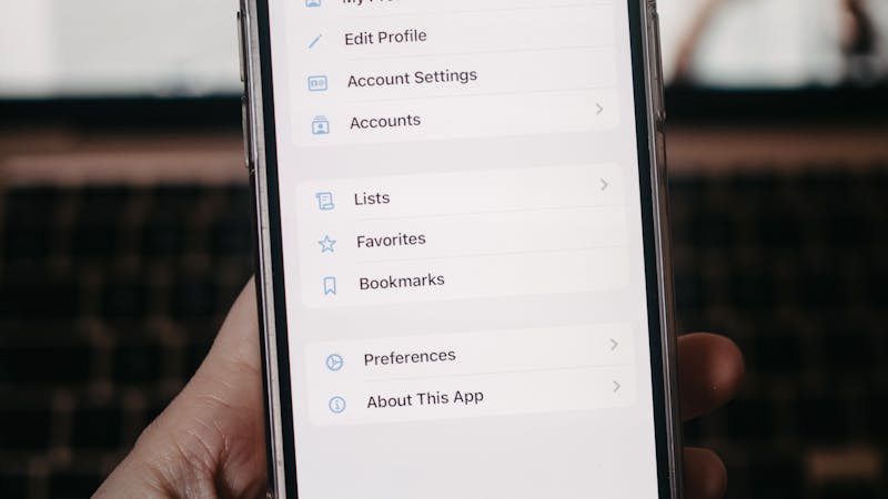
On mobile, settings need a different layout. The sidebar-and-content pattern does not work on small screens. Instead, use a drill-down navigation:
- Top level: list of sections (Profile, Notifications, Billing…)
- Tap a section: navigate to that section’s settings (full screen)
- Back button to return to the section list
This is the pattern iOS and Android use natively, and users understand it instinctively. Fighting it with a custom layout creates confusion.
Keep touch targets at least 44px tall. Toggles, buttons, and tappable rows should be easy to hit with a thumb. Cramped settings on mobile are a guaranteed source of mis-taps.
Putting It Together
A well-designed settings page is invisible. Users find what they need, change it, and move on. They never think about the settings page itself — and that is the highest compliment.
The principles are simple:
- Organize by user task, not technical structure
- Auto-save for low-stakes changes, explicit save for high-stakes ones
- Isolate destructive actions in a danger zone with confirmation
- Add search once you have more than 15-20 settings
- Choose sensible defaults so most users never need to visit settings at all
- Test on mobile — settings pages are frequently accessed on phones
We have applied these patterns across MindHyv, LancerSpace, and every product where users need to configure their experience. The details matter more than you think — a frustrating settings page erodes trust in the entire product.
If you are building a product and want help designing settings (or any other interface) that respects your users’ time, reach out at [email protected]. We obsess over these details so your users do not have to.